Import Libraries
1. Import Libraries
To load new pip package from https://pypi.org, run the following line. !pip install <package_name>. You need to validate packages. Otherwise your environment may be infected with a virus.
import pandas as pd
import matplotlib.pyplot as plt
Data Model
There are 3 datasets exists:
- city_list: This contains a list of cities and countries in the database. Look through them in order to find the city nearest to you.
- city_data: This contains the average temperatures for each city by year (ºC).
- global_data: This contains the average global temperatures by year (ºC).
ER Diagram
er_diagram = {'year': ['INT'], 'country': ['CHAR'], 'city': ['CHAR'], 'avg_temp_city': ['ENUM'], 'avg_temp_global': ['ENUM']}
er_diagram = pd.DataFrame(data=er_diagram)
er_diagram
| year | country | city | avg_temp_city | avg_temp_global | |
|---|---|---|---|---|---|
| 0 | INT | CHAR | CHAR | ENUM | ENUM |
SQL Statement
-- RENAME column name from global_data, city_data
ALTER TABLE city_data
RENAME COLUMN avg_temp TO avg_temp_city;
ALTER TABLE global_data
RENAME COLUMN avg_temp TO avg_temp_global;

-- INNER JOIN global_data and city_data tables
SELECT city_data.year, city_data.country, city_data.city, city_data.avg_temp_city, global_data.avg_temp_global
FROM city_data
INNER JOIN global_data ON city_data.year=global_data.year ORDER BY city_data.year, city_data.country, city_data.city;
2. Extract
I used pandas with read_csv function to extract csv to dataframe. Prefered to plot with matplotlib
- cum_sum: Cumulative summary of global temperature
- count: Indicates to nr. of years
- mov_avg: Moving average or rolling mean
df = pd.read_csv("../data/dataset.csv")
df
| year | country | city | avg_temp_city | avg_temp_global | |
|---|---|---|---|---|---|
| 0 | 1750 | Albania | Tirana | 15.91 | 8.72 |
| 1 | 1750 | Austria | Vienna | 8.86 | 8.72 |
| 2 | 1750 | Belarus | Minsk | 6.28 | 8.72 |
| 3 | 1750 | Belgium | Brussels | 10.73 | 8.72 |
| 4 | 1750 | Bosnia And Herzegovina | Sarajevo | 9.70 | 8.72 |
| ... | ... | ... | ... | ... | ... |
| 70234 | 2013 | Venezuela | Valencia | 26.60 | 9.61 |
| 70235 | 2013 | Vietnam | Hanoi | 23.10 | 9.61 |
| 70236 | 2013 | Vietnam | Ho Chi Minh City | 28.46 | 9.61 |
| 70237 | 2013 | Zambia | Lusaka | 20.14 | 9.61 |
| 70238 | 2013 | Zimbabwe | Harare | 19.76 | 9.61 |
70239 rows × 5 columns
3. Exploration
City filtered by Amsterdam
city_name = "Amsterdam"
df_ams = df.loc[df['city'] == city_name]
df_ams
| year | country | city | avg_temp_city | avg_temp_global | |
|---|---|---|---|---|---|
| 29 | 1750 | Netherlands | Amsterdam | 10.04 | 8.72 |
| 108 | 1751 | Netherlands | Amsterdam | 9.63 | 7.98 |
| 187 | 1752 | Netherlands | Amsterdam | 5.97 | 5.78 |
| 271 | 1753 | Netherlands | Amsterdam | 9.08 | 8.39 |
| 357 | 1754 | Netherlands | Amsterdam | 8.72 | 8.47 |
| ... | ... | ... | ... | ... | ... |
| 68726 | 2009 | Netherlands | Amsterdam | 10.33 | 9.51 |
| 69068 | 2010 | Netherlands | Amsterdam | 8.84 | 9.70 |
| 69410 | 2011 | Netherlands | Amsterdam | 10.73 | 9.52 |
| 69752 | 2012 | Netherlands | Amsterdam | 10.08 | 9.51 |
| 70094 | 2013 | Netherlands | Amsterdam | 9.54 | 9.61 |
264 rows × 5 columns
Moving Average
Moving average, i.e. rolling average, is used for calculating averages of window groups indeed having a smoother line to visualise trends better rather than seasonal effects.
year = df_ams['year']
global_temp_ma =  df_ams['avg_temp_global'].rolling(7).mean()
ams_temp_ma =  df_ams['avg_temp_city'].rolling(7).mean()

df_ams = df_ams.assign(ma_global = global_temp_ma.values, ma_amsterdam = ams_temp_ma.values)
df_ams
| year | country | city | avg_temp_city | avg_temp_global | ma_global | ma_amsterdam | |
|---|---|---|---|---|---|---|---|
| 29 | 1750 | Netherlands | Amsterdam | 10.04 | 8.72 | NaN | NaN |
| 108 | 1751 | Netherlands | Amsterdam | 9.63 | 7.98 | NaN | NaN |
| 187 | 1752 | Netherlands | Amsterdam | 5.97 | 5.78 | NaN | NaN |
| 271 | 1753 | Netherlands | Amsterdam | 9.08 | 8.39 | NaN | NaN |
| 357 | 1754 | Netherlands | Amsterdam | 8.72 | 8.47 | NaN | NaN |
| ... | ... | ... | ... | ... | ... | ... | ... |
| 68726 | 2009 | Netherlands | Amsterdam | 10.33 | 9.51 | 9.535714 | 10.541429 |
| 69068 | 2010 | Netherlands | Amsterdam | 8.84 | 9.70 | 9.560000 | 10.335714 |
| 69410 | 2011 | Netherlands | Amsterdam | 10.73 | 9.52 | 9.588571 | 10.401429 |
| 69752 | 2012 | Netherlands | Amsterdam | 10.08 | 9.51 | 9.561429 | 10.344286 |
| 70094 | 2013 | Netherlands | Amsterdam | 9.54 | 9.61 | 9.572857 | 10.140000 |
264 rows × 7 columns
4. Visualisation
The line is the best chart to observe a time series data. In this way, trends and movement directions can be clearly tracked.
plt.plot(year, global_temp_ma, label="Global")
plt.plot(year, ams_temp_ma, label="Amsterdam", color="red")
plt.legend()
plt.title( 'Comparison of Temperature Changes')
plt.xlabel ('Year')
plt.ylabel('Moving Average in °C')
plt.show()
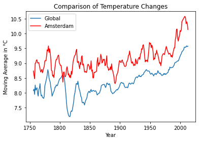
The graph shows the moving average of temperature changes in globe and Amsterdam, between 1750 and 2013. According to the graph, the years 1750 to 1800 saw the MA of temperatures in globe and Amsterdam increase and decrease by approximately the same directions. However, when global MAs reflect an overall increasing trend except for middle 1800s, Amsterdam MAs has quick and sharp up and downs compared to global ones. Also, it’s clearly seen that in Amsterdam, MA of temperatures are always above the global rates expect for the early 1800s. So that, Amsterdam is hotter compared to the global average. As overall, the world consistently getting hotter since the late 1850s.
city_name = "Berlin"
df_berlin = df.loc[df['city'] == city_name]
df_berlin
| year | country | city | avg_temp_city | avg_temp_global | |
|---|---|---|---|---|---|
| 17 | 1750 | Germany | Berlin | 9.83 | 8.72 |
| 96 | 1751 | Germany | Berlin | 9.75 | 7.98 |
| 175 | 1752 | Germany | Berlin | 4.84 | 5.78 |
| 255 | 1753 | Germany | Berlin | 8.72 | 8.39 |
| 341 | 1754 | Germany | Berlin | 8.49 | 8.47 |
| ... | ... | ... | ... | ... | ... |
| 68637 | 2009 | Germany | Berlin | 10.06 | 9.51 |
| 68979 | 2010 | Germany | Berlin | 8.61 | 9.70 |
| 69321 | 2011 | Germany | Berlin | 10.56 | 9.52 |
| 69663 | 2012 | Germany | Berlin | 9.96 | 9.51 |
| 70005 | 2013 | Germany | Berlin | 10.12 | 9.61 |
264 rows × 5 columns
year = df_berlin['year']
global_temp_ma =  df_berlin['avg_temp_global'].rolling(7).mean()
berlin_temp_ma =  df_berlin['avg_temp_city'].rolling(7).mean()

df_berlin = df_berlin.assign(ma_global = global_temp_ma.values, ma_berlin = berlin_temp_ma.values)
plt.plot(year, global_temp_ma, label="Global")
plt.plot(year, berlin_temp_ma, label="Berlin", color="red")
plt.plot(year, ams_temp_ma, label="Amsterdam", color="purple")
plt.legend()
plt.title( 'Comparison of Temperature Changes')
plt.xlabel ('Year')
plt.ylabel('Moving Average in °C')
plt.show()
city_name = "Paris"
df_paris = df.loc[df['city'] == city_name]
df_paris
| year | country | city | avg_temp_city | avg_temp_global | |
|---|---|---|---|---|---|
| 16 | 1750 | France | Paris | 11.18 | 8.72 |
| 95 | 1751 | France | Paris | 11.15 | 7.98 |
| 174 | 1752 | France | Paris | 6.97 | 5.78 |
| 254 | 1753 | France | Paris | 10.40 | 8.39 |
| 340 | 1754 | France | Paris | 10.15 | 8.47 |
| ... | ... | ... | ... | ... | ... |
| 68634 | 2009 | France | Paris | 11.46 | 9.51 |
| 68976 | 2010 | France | Paris | 10.41 | 9.70 |
| 69318 | 2011 | France | Paris | 12.33 | 9.52 |
| 69660 | 2012 | France | Paris | 11.22 | 9.51 |
| 70002 | 2013 | France | Paris | 11.01 | 9.61 |
264 rows × 5 columns
year = df_paris['year']
global_temp_ma =  df_paris['avg_temp_global'].rolling(7).mean()
paris_temp_ma =  df_paris['avg_temp_city'].rolling(7).mean()

df_paris =df_paris.assign(ma_global = global_temp_ma.values, ma_paris = paris_temp_ma.values)
df_paris
| year | country | city | avg_temp_city | avg_temp_global | ma_global | ma_paris | |
|---|---|---|---|---|---|---|---|
| 16 | 1750 | France | Paris | 11.18 | 8.72 | NaN | NaN |
| 95 | 1751 | France | Paris | 11.15 | 7.98 | NaN | NaN |
| 174 | 1752 | France | Paris | 6.97 | 5.78 | NaN | NaN |
| 254 | 1753 | France | Paris | 10.40 | 8.39 | NaN | NaN |
| 340 | 1754 | France | Paris | 10.15 | 8.47 | NaN | NaN |
| ... | ... | ... | ... | ... | ... | ... | ... |
| 68634 | 2009 | France | Paris | 11.46 | 9.51 | 9.535714 | 11.582857 |
| 68976 | 2010 | France | Paris | 10.41 | 9.70 | 9.560000 | 11.368571 |
| 69318 | 2011 | France | Paris | 12.33 | 9.52 | 9.588571 | 11.510000 |
| 69660 | 2012 | France | Paris | 11.22 | 9.51 | 9.561429 | 11.462857 |
| 70002 | 2013 | France | Paris | 11.01 | 9.61 | 9.572857 | 11.351429 |
264 rows × 7 columns
plt.plot(year, global_temp_ma, label="Global")
plt.plot(year, berlin_temp_ma, label="Berlin", color="red")
plt.plot(year, ams_temp_ma, label="Amsterdam", color="purple")
plt.plot(year, paris_temp_ma, label="Paris", color="green")
plt.legend()
plt.title( 'Comparison of Temperature Changes')
plt.xlabel ('Year')
plt.ylabel('Moving Average in °C')
plt.show()
city_name = "Istanbul"
df_istanbul = df.loc[df['city'] == city_name]
df_istanbul
| year | country | city | avg_temp_city | avg_temp_global | |
|---|---|---|---|---|---|
| 50 | 1750 | Turkey | Istanbul | 13.83 | 8.72 |
| 129 | 1751 | Turkey | Istanbul | 14.14 | 7.98 |
| 208 | 1752 | Turkey | Istanbul | 9.48 | 5.78 |
| 293 | 1753 | Turkey | Istanbul | 13.42 | 8.39 |
| 379 | 1754 | Turkey | Istanbul | 13.58 | 8.47 |
| ... | ... | ... | ... | ... | ... |
| 68798 | 2009 | Turkey | Istanbul | 14.95 | 9.51 |
| 69140 | 2010 | Turkey | Istanbul | 15.60 | 9.70 |
| 69482 | 2011 | Turkey | Istanbul | 13.65 | 9.52 |
| 69824 | 2012 | Turkey | Istanbul | 14.97 | 9.51 |
| 70166 | 2013 | Turkey | Istanbul | 16.02 | 9.61 |
264 rows × 5 columns
year = df_istanbul['year']
global_temp_ma = df_istanbul['avg_temp_global'].rolling(7).mean()
istanbul_temp_ma = df_istanbul['avg_temp_city'].rolling(7).mean()
df_istanbul = df_istanbul.assign(ma_global = global_temp_ma.values, ma_istanbul = istanbul_temp_ma.values)
df_istanbul
| year | country | city | avg_temp_city | avg_temp_global | ma_global | ma_istanbul | |
|---|---|---|---|---|---|---|---|
| 50 | 1750 | Turkey | Istanbul | 13.83 | 8.72 | NaN | NaN |
| 129 | 1751 | Turkey | Istanbul | 14.14 | 7.98 | NaN | NaN |
| 208 | 1752 | Turkey | Istanbul | 9.48 | 5.78 | NaN | NaN |
| 293 | 1753 | Turkey | Istanbul | 13.42 | 8.39 | NaN | NaN |
| 379 | 1754 | Turkey | Istanbul | 13.58 | 8.47 | NaN | NaN |
| ... | ... | ... | ... | ... | ... | ... | ... |
| 68798 | 2009 | Turkey | Istanbul | 14.95 | 9.51 | 9.535714 | 14.474286 |
| 69140 | 2010 | Turkey | Istanbul | 15.60 | 9.70 | 9.560000 | 14.715714 |
| 69482 | 2011 | Turkey | Istanbul | 13.65 | 9.52 | 9.588571 | 14.632857 |
| 69824 | 2012 | Turkey | Istanbul | 14.97 | 9.51 | 9.561429 | 14.738571 |
| 70166 | 2013 | Turkey | Istanbul | 16.02 | 9.61 | 9.572857 | 15.011429 |
264 rows × 7 columns
plt.plot(year, global_temp_ma, label="Global", color="darkorange")
plt.plot(year, istanbul_temp_ma, label="Istanbul", color="red")
plt.plot(year, berlin_temp_ma, label="Berlin", color="blue")
plt.plot(year, ams_temp_ma, label="Amsterdam", color="purple")
plt.plot(year, paris_temp_ma, label="Paris", color="green")
plt.legend()
plt.title( 'Comparison of Temperature Changes')
plt.xlabel ('Year')
plt.ylabel('Moving Average in °C')
plt.show()
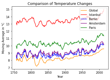
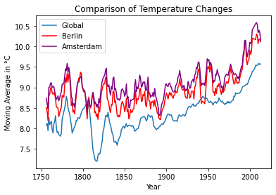
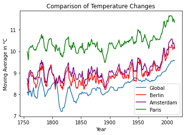
The Comparison of Temperature Changes graph displays 5 rolling averages as Istanbul, Berlin, Amsterdam, Paris and Global. As Istanbul is the hottest city, Paris follows her. Althoug, Berlin is colder than Amsterdam, they is a strong pozitif correlation between them.